Colour Psychology in Branding: Strategy That Sells
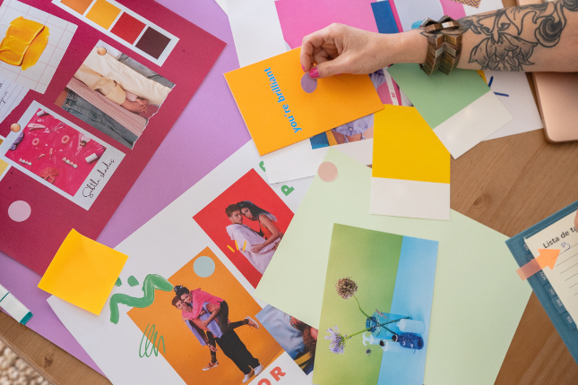
When you think of brand strategy, colour might feel like the “fun” part. The part you get to play with after you’ve nailed your business plan and figured out your audience.
But here’s the truth: colour isn’t just pretty. It’s powerful.
In fact, research shows that up to 90% of a consumer’s first impression of a brand is based on colour alone. Therefore, when you’re launching your personal brand, your wellness start-up, or even a product that has to fight for shelf space. Colour can be the difference between “meh” and magnetic.
So let’s dig into the psychology, the neuromarketing science, and the real-world brand examples that prove one thing. If you don’t take your brand colours seriously, you’re leaving influence and sales on the table.
Why colour psychology is a cornerstone of branding
Colour psychology is the study of how colours impact human behaviour and emotions. It’s not just theory. Neuromarketing research shows that different colours trigger specific brain responses that influence trust, urgency, calm, or even hunger.
For entrepreneurs, this means your brand palette isn’t decoration. It’s a strategy. Your colour sets the emotional tone before your audience ever reads your tagline or clicks your website.
A well-chosen palette can:
- Build instant recognition: think of Ferrari, all you can think is in red.
- Drive emotional association: green for nature or blue for trust..
- Increase brand loyalty by creating a consistent sensory experience.
As one MDPI study noted, colour directly affects consumer perception and can strengthen the relationship between people and brands. That’s not fluff—it’s neuroscience.

Neuromarketing angle: what your brain does with colour
Here’s where it gets fascinating. Neuromarketing studies show that:
- Warm colours like red and orange stimulate excitement and urgency. They literally increase heart rate and create a sense of action.
- Cool colours like blue and green activate feelings of calm, trust, and balance.
- Black and gold trigger areas of the brain linked with status and luxury.
Louis Cheskin, a pioneer in neuromarketing, called this sensation transference: change the colour of a product or package, and you change the way people perceive its quality. Even if nothing else changes.
That’s why brands invest millions in getting their colours right. They’re not picking “what looks nice.” They’re picking what converts.
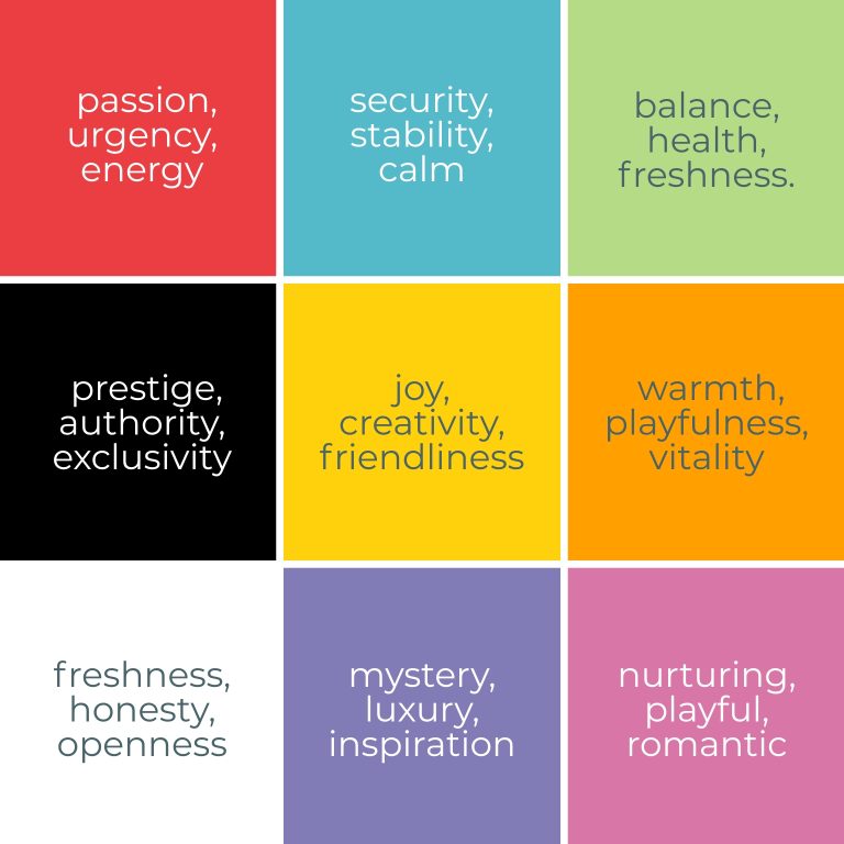
What each colour communicates in branding
Here’s what you have been searching for. Let’s break down the heavy-hitters and show you which brands are using them strategically, both here in Australia and in the global wellness space.
🔴 Red
Red has the longest wavelength in the visible spectrum, which means it’s literally the first colour the human eye notices. It speeds up heart rate and increases blood pressure, which our brain interprets as excitement or danger. That’s why stop signs are red. Plus, it’s the reason why brands like Lululemon use it to fuel intensity and community vibes.
- Emotion triggered: passion, urgency, energy.
- Best for: fitness, food, entertainment, promotions.
Brands that use RED as brand colour
- Lululemon: uses red to fuel energy, community, and athletic drive.
- Qantas: leans into red for national pride and dynamic movement.
- Coca-Cola: excitement, joy, and timeless vibrancy.
🔵 Blue
Blue is often associated with open skies and clear water, elements that signal safety and predictability in nature. Biologically, it lowers heart rate and calms the nervous system, which is why hospitals and banks often use it. In neuromarketing, blue is one of the most effective colours for building trust: think PayPal, IBM or Telstra. Brands where credibility is non-negotiable.
- Emotion triggered: security, stability, calm.
- Best for: finance, healthcare, corporate services.
Brands that use BLUE as brand colour
- Telstra: Australia’s leading telecom, communicates stability in telecom services.
- PayPal: signals security and credibility in finance.
- IBM: long-standing authority and trust in tech.
🟢 Green
Green sits right in the middle of the visible spectrum, so it’s easy on the eyes. Historically, it’s been linked to growth, fertility, and renewal (plants, fresh food, springtime). Modern consumers also tie it directly to eco-consciousness and wellness. Brands like Sukin or Whole Foods lean on this association to signal “good for you, good for the planet.”
- Emotion triggered: balance, health, freshness.
- Best for: wellness, sustainability, eco-products.
Brands that use GREEN as brand colour
- Sukin: the Australian natural skincare brand, leans into earthy greens to back up its eco-friendly promise.
- Whole Foods: uses green as freshness, organic lifestyle, healthy living.
- Spotify: its green is for growth, creativity, and connection.
⚫ Black
Black isn’t technically a colour, it’s the absence of light. That very absence makes it authoritative and dominant. In design, it reduces distraction and puts focus on form and typography. Psychologically, it’s associated with control and luxury, which is why high-end brands like Nike and Aesop lean heavily into it.
- Emotion triggered: prestige, authority, exclusivity.
- Best for: luxury wellness, premium beauty, high-ticket services.
Brands that use BLACK as brand colour
- Aesop: uses pared-back black and neutral tones to ooze understated luxury skincare.
- Nike: its iconic black swoosh speaks power and performance.
- Chanel: if you know, you know. Black Chanel is timeless elegance and premium quality.
🟡 Yellow
Yellow is the most reflective colour in the spectrum, grabbing attention quickly. Psychologically, it stimulates serotonin, the feel-good hormone. But because it’s also the colour of warning signs, too much yellow can trigger anxiety. Brands like Boost Juice and McDonald’s use it in small doses to create cheerfulness and accessibility.
- Emotion triggered: joy, creativity, friendliness.
- Best for: lifestyle, youth-oriented products, community brands.
Brands that use YELLOW as brand colour
- McDonald’s: best example for fast, approachable, friendly yellow brand.
- IKEA: uses yellow as an expression of affordable design with a playful twist.
- Boost Juice’s: conveys energy, freshness, fun, and community-focused.
🟠 Orange
Orange combines the urgency of red with the cheer of yellow. Neurologically, it’s seen as energetic but less aggressive than red, which is why it’s perfect for brands like Headspace—encouraging action without intimidation. It’s also commonly linked to affordability and friendliness, think Bunnings Warehouse in Australia.
- Emotion triggered: warmth, playfulness, vitality.
- Best for: wellness apps, community projects, retail.
Brands that use ORANGE as brand colour
- Headspace: mental health made friendly and approachable.
- Bunnings Warehouse: accessibility and community value.
- Fanta: its orange is a clear playful, youthful energy.
⚪ White
White reflects all wavelengths of light, giving a sense of openness and space. It’s linked to new beginnings, minimalism, and clinical precision. But context matters: in some Asian cultures, white represents mourning. Brands like Apple and Endota Spa use it to signal clarity and clean simplicity.
- Emotion triggered: freshness, honesty, openness.
- Best for: spas, wellness retreats, tech products.
Brands that use WHITE as brand colour
- Apple: its white is a clear example of a clean, futuristic, and user-friendly brand.
- Endota Spa: fresh, serene, minimal wellness.
- Adidas: against nike’s black, adidas is white meaning simplicity and clarity in sportswear.
💜 Purple
Historically, purple dyes were rare and expensive, reserved for royalty. That cultural memory still lingers. Purple feels aspirational and slightly mystical. It’s also tied to creativity and imagination, making it popular with meditation apps or spiritual wellness brands.
- Emotion triggered: mystery, luxury, inspiration.
- Best for: holistic wellness, spiritual coaching, premium services.
Brands that use PURPLE as brand colour
- Cadbury: indulgence and richness.
- Lorna Jane: an activewear brand in Australia, its purple leand into inspiration, empowerment, community.
- Twitch: the most famous streaming platform uses purple as creativity, imagination, and innovation.
🌸 Pink
The last, but not least. Pink is essentially “red softened with white,” so it keeps the passion but adds calm and gentleness. Neurologically, softer pinks reduce feelings of aggression, which is why they’re often used in wellness and beauty. Bold pinks, on the other hand, bring fun and youthful energy.
- Emotion triggered: nurturing, playful, romantic.
- Best for: beauty, personal brands, lifestyle.
Brands that use PINK as brand colour
- Frank Body: playful, cheeky, beauty-forward.
- Glossier: soft minimalism with a modern edge.
- Barbie: bold, fun, youthful femininity, even if it’s a bit controversial.
The cultural layer: why “one size fits all” doesn’t work
One mistake I see entrepreneurs make? Copying colour palettes from international brands without considering cultural context.
In Australia’s multicultural market, colours can carry layered meanings. For example, while white often symbolises purity in Western markets, it can represent mourning in some Asian cultures.
If your brand targets a global audience, you’ll need to stress-test your palette across markets.
How to choose your brand colours strategically
Here’s a simple framework to guide your colour strategy:
- Anchor to your brand values: what emotion do you want your audience to feel? Calm? Excited? Empowered?
- Analyse your audience: if you’re speaking to stressed CEOs, calm blues may resonate more than energetic reds.
- Audit your competitors: Standing out matters. If every local wellness brand is going green, maybe a warm orange gives you the edge.
- Test & validate: use A/B testing on ads or landing pages with different palettes. Track click-through rates, dwell time, and conversions.
- Stay consistent: the fastest way to kill brand trust is inconsistency. Use the same palette across socials, website, packaging, and print.
Practical takeaways for entrepreneurs
If you are reading this article, probably you have been thinking about the branding of your actual or future project. In both cases, you still have time to rethink and rebrand if it’s convenient. I am going to give you an advice that I would love to have when I was starting in my branding journey:
- Don’t pick colours you “like”. Pick colours that align with your brand strategy.
- Create a primary palette (2–3 key colours) and a supporting palette (secondary shades, neutrals).
- Name your colours internally (“Ocean Blue,” “Vitality Green”) to reinforce brand storytelling.
- Use tools like Coolors or Adobe Color to test palettes.
- Document your palette in brand guidelines to maintain consistency as you scale.
All of this will give you consistency in your branding. Key to success.
Colour as your silent brand ambassador
Here’s the thing: as a founder, you won’t always be in the room to tell your story. But your brand colours will be.
They’ll whisper trust, shout excitement, or glow with calm, long before anyone reads your website copy or listens to your podcast.
So don’t treat colour as an afterthought. Treat it as a strategy. Because when used intentionally, colour isn’t just pretty. It’s powerful.
When you strip away the logo, their colours still speak. That’s the goal.

Kellie Maloney - Founder of enkompass
About the Author
Kellie Maloney is a seasoned content marketing strategist, rocking the world of digital content and marketing for over 20 years! With a solid marketing and business background and degree, ongoing studies in nutritional science, and certification as an Integrative Health Coach, Kellie seamlessly blends her love for all things wellness with her rock-star professional background! She shares her passion for content marketing and wellness on her blog, Get the Scoop and via her IG at @enkompass.
Sign Up
Weekly Connection
Subscribe and get instant access to
THE ESSENTIAL GUIDE:
Creating Content That Connects for Health & Wellness Pro’s.
With more resources, expert content planning and creation tips, case studies, insights, and all the good things delivered weekly!
